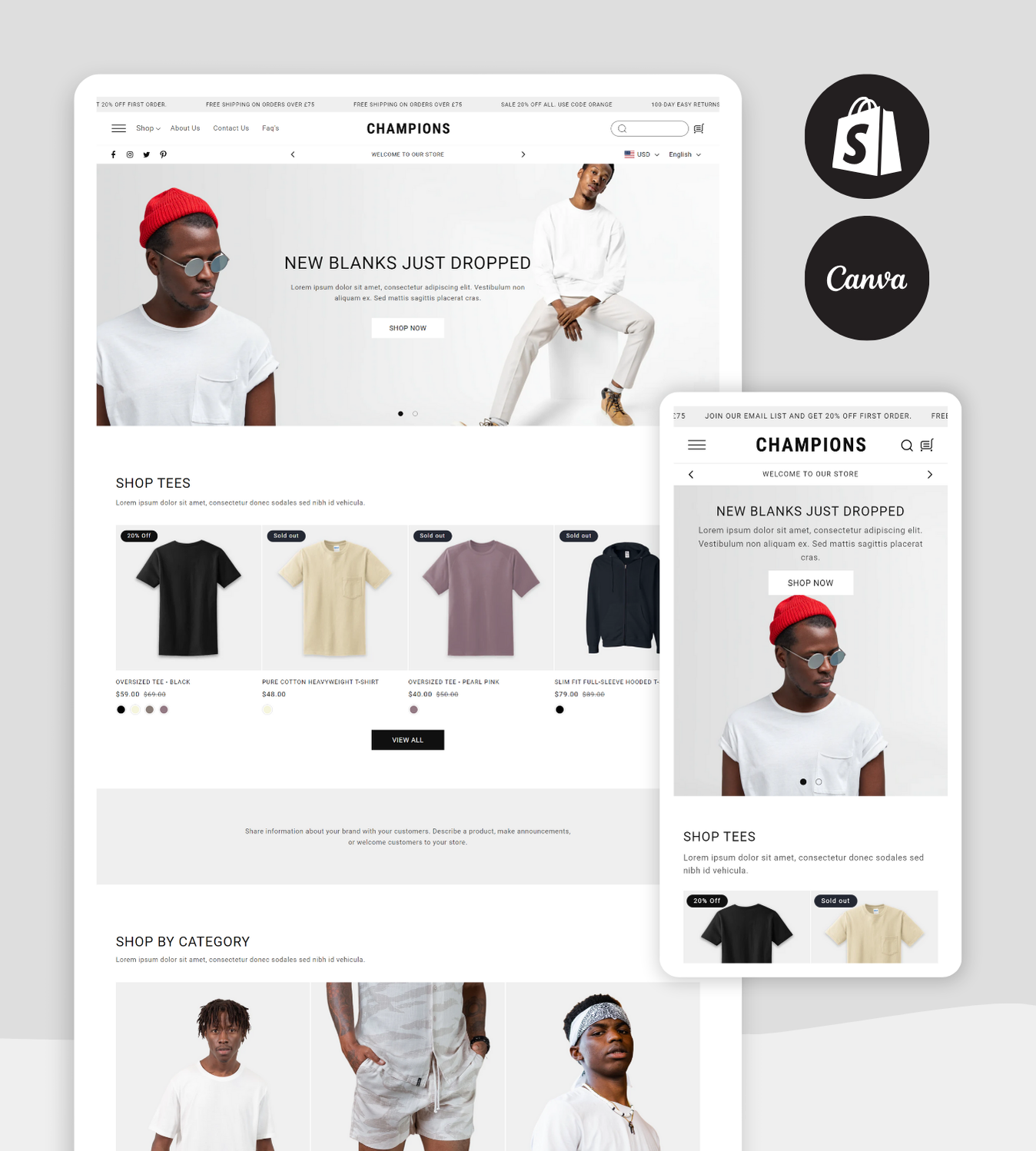
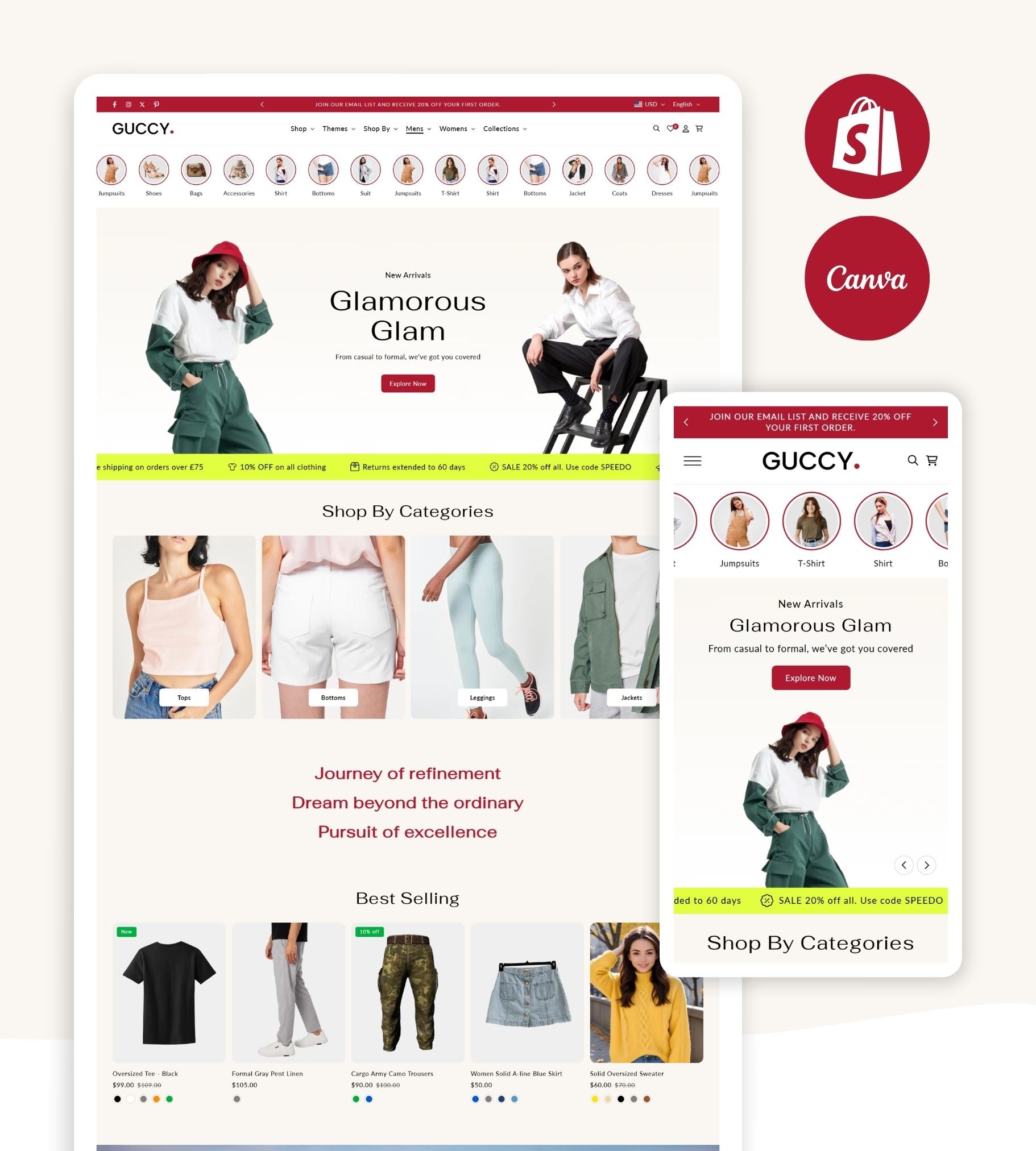
Welcome to the era where your website isn’t just your storefront—it’s your entire sales pitch. For supplement brands especially, your online presence needs to scream “trustworthy,” “modern,” and “buy-worthy” in a single scroll. Yet too many brands are still stuck with outdated layouts, clunky navigation, and cringeworthy branding.
If your website traffic is up but sales are flatlining, chances are it’s not your product—it’s your design. Let’s break down the most common blunders that destroy conversions and how to fix them fast.
Mistake #1: Treating Design Like an Afterthought
This might sound harsh, but slapping together a website using a random layout that “looks okay” just doesn’t cut it anymore. Supplement shoppers are savvy. They're not just looking for any protein powder or multivitamin—they're investing in health, performance, and longevity. The Best Supplement Website Design should reflect that value visually and functionally.
Your design isn’t just decoration. It’s your silent salesman. If it’s not persuasive, sleek, and frictionless, customers bounce.
What to do instead: Invest in tailored Nutrition Website Templates that highlight product benefits, guide the eye with intuitive layout flows, and are built specifically for health-focused consumers.
Mistake #2: Using a Template That Looks Like Everyone Else’s
Yes, templates are time-saving. But generic ones? They're a conversion killer. If your site looks like every other Shopify store, you’re instantly forgettable.
In the wellness and nutrition space, your brand story is everything. Generic design strips away that emotional connection. The Shopify Store Template you choose should support, not suppress, your brand identity.
What to do instead: Go for a Modern Shopify Theme that allows deep customization without sacrificing speed. Think bold colors, custom fonts, and high-resolution images that scream uniqueness.
Mistake #3: Not Designing for Mobile-First Behavior
Most of your users are scrolling from their phones, yet many supplement sites are still stuck in the desktop-only mindset. Sloppy mobile responsiveness leads to awkward buttons, cropped product images, and misaligned CTAs. Bad move.
Mobile-first design is no longer optional. The Best Supplement Website Design today should work like a charm across all screen sizes, especially smartphones.
What to do instead: Choose Nutrition Website Templates that are mobile-optimized from the get-go. Speed, legibility, and tap-friendly interfaces should be built in, not retrofitted.
Mistake #4: Cluttered Layouts with Zero Breathing Space
When your homepage feels like it’s yelling at your visitors—with flashing banners, excessive colors, and too many calls to action—you’re not being persuasive. You’re being pushy.
Consumers associate clutter with chaos. In contrast, clean layouts create trust. Minimalism isn’t a trend—it’s a conversion tool.
What to do instead: Go for a Modern Shopify Theme that emphasizes whitespace, intentional hierarchy, and smooth visual flow. Less really is more when you’re trying to convert.
Mistake #5: Weak Product Pages That Don’t Sell
Here’s the raw truth: most supplement product pages suck. They drop a product image, list ingredients, slap on a “Buy Now” button, and call it a day. But consumers need more: lifestyle imagery, customer reviews, clear benefit breakdowns, dosage instructions, certifications, etc.
If your product pages look like an ingredient label, you’re not selling. You’re listing.
What to do instead: Elevate your product pages using Shopify Store Template built for high engagement. Leverage templates that include dedicated spaces for video, comparison charts, FAQs, and trust badges. The Best Supplement Website Design doesn’t just present a product—it makes a persuasive case for it.
Mistake #6: Unintuitive Navigation That Loses the Sale
Want to see a conversion rate drop? Confuse your visitors. Bad menus, hidden categories, and unnecessary clicks are all signs of a broken user journey. If users can’t find what they came for in three clicks or less, you’ve already lost them.
What to do instead: Clean, clear navigation is non-negotiable. Smart Nutrition Website Templates prioritize UX. Look for Shopify themes that feature sticky nav bars, prominent search functions, and logical category organization.
Mistake #7: Slow Load Speeds That Turn Off Shoppers
The supplement industry is competitive. If your page takes longer than 3 seconds to load, it’s not just inconvenient—it’s catastrophic. Users abandon, rankings drop, and bounce rates shoot up. The truth? Many slow sites are burdened by bloated themes or poor image optimization.
What to do instead: Pick a Modern Shopify Theme optimized for speed. That means compressed files, clean code, lazy loading, and lightning-fast performance. Supplement buyers are fast-paced—your site should be too.
Mistake #8: Overpromising Without Visual Proof
You say your supplement transforms lives. Great. Where’s the proof? Your audience wants validation. They want to see transformations, social proof, before-and-afters, and user-generated content.
If your site leans too much on text and lacks visual storytelling, you’re losing trust and conversions.
What to do instead: Use a Shopify Store Template that supports embedded testimonials, carousel reviews, influencer videos, and customer photos. Real visuals build real confidence.
Mistake #9: No Brand Consistency Across Pages
Your homepage is high-end. Your product pages? Meh. Your blog? A different font entirely. That kind of inconsistency doesn’t just look amateur—it makes you seem untrustworthy.
The Best Supplement Website Design carries a consistent voice, aesthetic, and experience across every page.
What to do instead: Use customizable Nutrition Website Templates that let you lock in your color palette, font pairings, CTA styles, and brand tone from top to bottom. Consistency builds credibility—and makes your brand memorable.
Mistake #10: Forgetting the Power of Modern Design Psychology
Design is psychology in action. Rounded corners feel safer. Blue builds trust. Strategic spacing calms. Every pixel can nudge a user toward (or away from) clicking “Buy Now.”
If your layout isn’t designed with these principles in mind, it might look “fine”—but perform poorly.
What to do instead: Leverage the Modern Shopify Theme designed by people who understand UX psychology. The best designs aren’t just pretty—they're engineered for conversions. They pull people in, guide them gently, and make it easy to say yes.
Ready to Fix It? Speedo Themes Has Your Back
If you're nodding along to any of the above, it’s time to clean house—and start fresh. Speedo Themes specializes in performance-driven, beautifully crafted designs built for health and wellness brands that want to win.
Whether you're launching a new supplement line or trying to rescue a sluggish site, our range of Shopify Store Template, Nutrition Website Templates, and Modern Shopify Theme is built to deliver. Expect sleek layouts, blazing speed, mobile-first functionality, and a whole lot of wow factor.
With Speedo Themes, your website isn’t just a page—it’s a powerhouse.
Final Word
Your supplement brand deserves more than just a pretty site—it needs a Best Supplement Website Design that works. That converts. That captivates. Every design decision should build trust, reduce friction, and inspire action.
Stop settling for mediocre. Your brand, your buyers, and your bottom line deserve better.
And now? You know exactly how to make that happen.


